
Today we are excited to announce the launch of EPI’s new corporate visual identity, signalling a new era for EPI communication. We would like to underline that this is our corporate brand, not the commercial brand which will have a separate identity, currently under development.
The new look demonstrates a commitment to our mission: the successful launch of Europe’s payment alternative. The updated brand universe features clean, modern typography, a distinctive new arch symbol and optimistic colour palette. The updated logo features a check-mark which when joined together forms a bridge graphic.
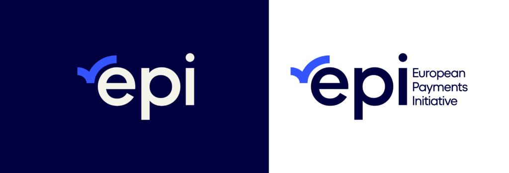
The checkmark signifies EPI’s role delivering secure instant payments. The bridge – like those featured on Euro bank notes – is in reference to EPI’s role connecting Europe and the payment industry at large.

And to answer the question of how to pronounce our name; we like to say “Epi” as one word, but are more than happy for it to be spelled out as “E.P.I” too.
We would like to thank all those who have worked to bring our new brand identity to life. Here’s to the next step in EPI’s evolution.